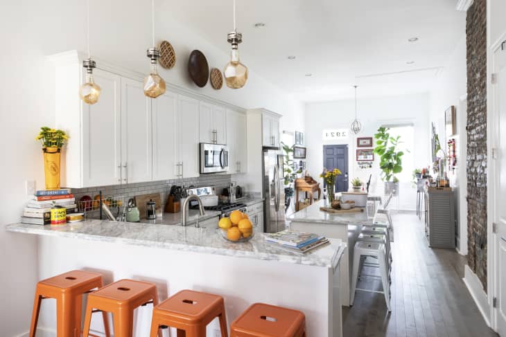

Do the kitchens you see on Instagram, Pinterest, and home improvement shows start to blend together after a while? No surprise if so, because, well, trends are trends for a reason. And if you’re tired of seeing, say, all-white, all-the-time kitchens, imagine how designers feel! They live and breathe this stuff, and you can bet they are so over some of it.
What’s more, trend-chasing isn’t necessarily the route to a space you feel most at home in. “There can be instances where homeowners — whether working with a designer or decorating themselves — are insistent on implementing a trend that does not work for their space or needs.” says Jessica Shaw of Turett Collaborative. “Ultimately, if the form is not serving a function, that is when a trend becomes unfavorable.”
With that in mind, let’s take a look at the seven most overdone kitchen trends, according to interior designers.
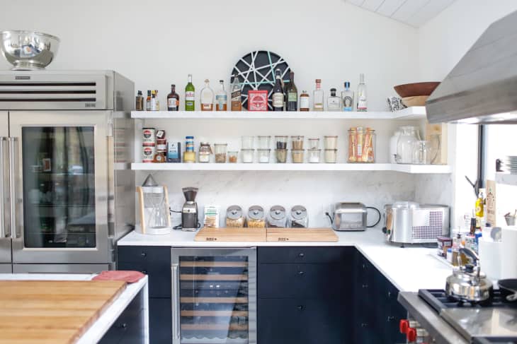
1. All open or floating shelves
Has there ever been a more divisive trend? Love ’em or hate ’em, people seem to be very firmly in one camp or the other. Here’s what Kim Turner of Kim Turner Design and Dwell with Dignity has to say: “I predict one day this trend will date your kitchen just as much as avocado green appliances and Formica countertops. It’s time to say goodbye to open shelving,” says Turner.
Ginger Curtis of Urbanology Designs is less absolute, but absolutely wants to say bye-bye to open shelves on either side of the vent hood. “Don’t get me wrong, there is absolutely a great appeal for some open shelving in your kitchen, but flanking either side of the vent hood is feeling very overdone and becoming a builder-grade staple,” she says. “Instead, create some asymmetry by doing floating shelves on only one side of the vent hood, or in another spot entirely.”
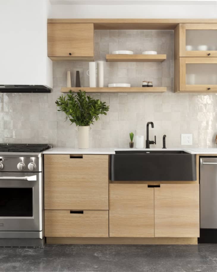
If you’re still on the fence about open shelves, how can you make the call? “You have to be honest with yourself about whether or not you can maintain the look and if your functional items are display-worthy or better tucked away,” says T.K. Wismer of Department of the Interiors. “If I am in a client’s kitchen and he or she asks the question, I randomly open a few cabinets and say ‘imagine it like this.’ That usually helps them reach their own conclusion.”
2. Subway tile backsplash (especially to the ceiling)
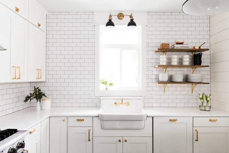
If Loree Beth Harris of Both Minds Design never sees another white subway backsplash extending to the ceiling, it’ll be too soon. “There are so many alternatives to subway tile,” she says. There’s zellige, slab splashes, stone veneers, even vertically stacking a subway could create some visual interest, she explains.
“There is, of course, the cost consideration when it comes to your backsplash, which is why I think less is more,” she adds. “Consider finding a beautiful marble or hand-made option, but don’t take it to the ceiling.”
3. Monster range hoods
“The perception of large, industrial-inspired range hoods have gone from old-school to chic in recent years,” Shaw says. “While these hoods are beautiful and a great fit for some spaces, they can also throw off the scale in a smaller kitchen and take up valuable negative space. Thinking strategically about your appliances and the layout of a kitchen should reflect practical cooking needs before focusing on the decorative.”
Natalie Officer of Natalie O Design agrees. “Trophy range hoods feel really over to us. This is not the hood ornament of the kitchen, rather a functional appliance that can be artfully considered in the design. Spending extra to feature functional tools doesn’t fit the current vibe of life. If you have to scream ‘special’ or ‘expensive,’ the melody of the design is interrupted.” (But if you’re going to splurge, “Trophy tile! Now that is a winning proposition,” she says.)
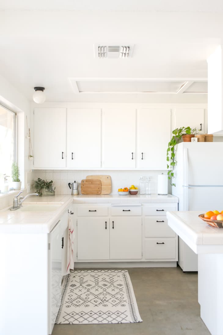
4. Light and white palettes for wood and cabinets
“My (probably unpopular) opinion on an overdone trend in the design world right now are kitchens with light wood and white cabinetry,” says Harris. “Social media outlets and Pinterest are saturated with this trend. Maybe people are hesitant to go with all wood cabinetry, or something with a richer/darker tone? Regardless, I vote we move on.”
Officer seconds that motion. “White or grey cabinets with that age-old Shaker door profile feels tired, and overused. There are so many other ways to create sustainable beauty,” she says. “Spending tens of thousands of dollars to create a ‘timeless’ design that is already asleep feels like a disappointing return on investment. Don’t make it a snore.” Instead, she suggests turning up the color and the texture: “Give it color and life that works with and maybe even hides the ‘use’ in a way you never tire of.”
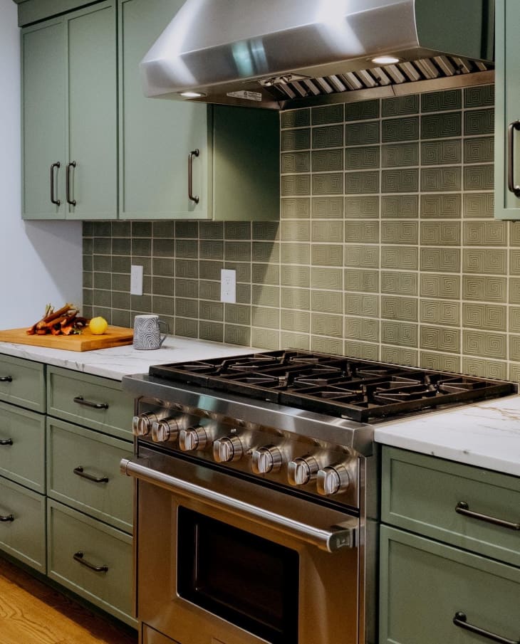
If you take the color route, another trend pitfall awaits, though. “Over the years, both painted and stained cabinets have stood the test of time,” says Turner, “but a trend I am over is ‘two-toned’ cabinets where the upper set of cabinets is painted a different color than the lower set, or the island is painted a different color from the cabinets.” Fortunately, she says, this can be easily changed.
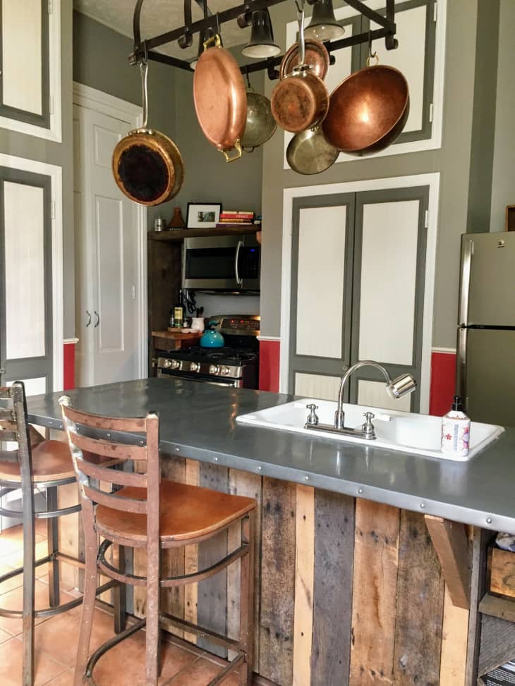
5. Hanging pot racks
Pots and pans that are easy to reach. Sounds great, right? But Sam Tannehill of Sam Tannelhill Designs is happy to see this trend go. “While this trend was, in theory, a great space saver and option to easily grab a pot or pan, it creates a warpath in your kitchen and is just a mess to look at,” she says. Modern kitchens have cabinets built-in, specifically for pots and pans, that can accommodate and alleviate the need for a pot rack on the ceiling, Tannelhill explains.
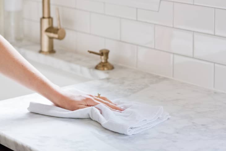
6. High-maintenance marble countertops
Now, what about those spendy, status countertops? “Marble countertops have seen a resurgence in the past decade or so,” Turner says. “It’s a beautiful natural stone, but I steer my clients away if imperfections will bother them. Marble will etch, and it will stain, and while there are measures you can take to minimize these issues, you cannot completely avoid them.”
The alternative? Granite, she says, is sturdy and is almost impossible to stain or etch. “There are more types and patterns of granite that are available than you could easily count.”
Another wise choice is a manmade or manufactured stone material such as quartz. The main thing to remember about types of countertop materials is to be sure you are educated on the pros and cons of each option, she adds. “It’s not just about what is the prettiest.”
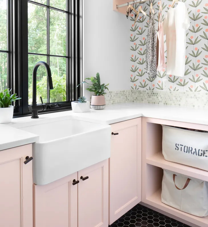
7. Farmhouse sinks
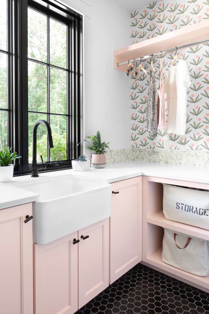
Are the Instagram darlings really over? Turner thinks it’s time. “I personally like the look of the widely popular farmhouse sinks, but I have always advised against them,” she says. “I knew they would be a trend — unless you actually lived in an old farmhouse.” Another reason Turner thinks they’re over? She considers them to be a good way to waste water, whether you filled the sink even a third full or let the water run while you washed dishes. “Wasteful and trendy — a bad combination,” she says.
