Designers use tile, color and other details to give this classic bathroom arrangement personal style

Designer: Ami McKay of PURE Design
Location: Vancouver
Size: 50 square feet (4.6 square meters); 5 by 10 feet
Homeowners’ request. This bathroom is shared by two sisters. “The homeowners challenged us to design a bathroom their girls will love forever,” designer Ami McKay says. “A space they will want to take a little more time in washing their hands, brushing their teeth, bathing and showering. The shower-tub combo is the perfect solution for kids and teens to have the freedom of choice between a quick shower or a long soak.”
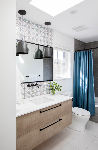
Special feature. Custom Spanish-inspired hand-painted tile above the vanity. “We kept the shower tile neural, then splurged in both style and budget on the custom tiles around the sink,” McKay says.
Other special features. Industrial-style pendants. Custom floating wood vanity. Teal shower curtain. Glossy gray shower tile and tub surround. Black hardware, plumbing fixtures, mirror frame and curtain rod.
“Uh-oh” moment. “The original tiles we chose for behind the mirror were canceled, and we all had our heart set on them,” McKay says. “For me, this is always an opportunity to push further. So we went and designed our own tile.”
Designer: Stacy Eisenmann and Aska Wieloch-Kim of Eisenmann Architecture
Location: Albany, California
Size: 48 square feet (4.5 square meters); 6 by 8 feet
Homeowners’ request. “We had a very limited area for this bathroom — it had to share space with the laundry in a separately accessible closet,” designer Stacy Eisenmann says. “Fortunately, we had a lot of volume, which increased the sense of space. This is a kids’ bathroom, so the tub was preferred by the clients. And tubs also need a little less width than showers.”
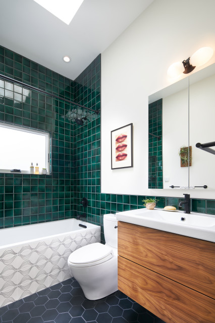
Special feature. High ceiling with a skylight. “The ceiling that turned out to be such a success was originally supposed to be dropped,” Eisenmann says. “But during the construction we liked how it added a sense of being lifted. Sometimes small spaces do not want to be too tall, but in this case, with a large skylight it was a bonus.”
Other special features. Emerald green wall tile. Custom patterned tub apron. Black hexagonal floor tile. Floating wood vanity with flat-panel drawers.
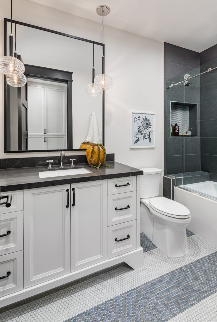
Designers: Kacie Lilly and Stacy Scharf of K and Q Interiors
Location: Scottsdale, Arizona
Size: 78 square feet (7.2 square meters)
Homeowners’ request. For this spec house, the builder asked designers Kacie Lilly and Stacy Scharf to make a modern and unique home that would appeal to a wide variety of buyers. This is an en suite secondary bathroom for a home with a family in mind, so the design team added a shower-tub combo to give future owners and their kids the option to take a bath or a shower.
Special feature. Penny round floor tile in two colors and a striped pattern. The designers used the same tile to accent the back of the shower niche.
Other special features. Dark gray countertop with white veining. White vanity (Reserve by Sherwin-Williams). Charcoal gray 12-by-24-inch shower tiles. “This bathroom continues the theme in the rest of the house, which is high contrast and maximum interest created with black, white and gray,” Lilly says.
Designer tip. “Our must-have feature in any-size shower or tub-shower combo is a decorative soap niche,” Lilly says. “It is a little window of design opportunity.”
Designer: Andrew Ashey of AAmp Studio
Location: Toronto
Size: 47 square feet (4.4 square meters); 5½ feet by 8½ feet
Homeowners’ request. “This is a bathroom for the clients’ child,” architect Andrew Ashey says. “They requested that it be bright and cheerful while being mindful of the rest of the home’s modern design. Their child played a big part in selecting the tile and color. While this is primarily the child’s bathroom, it also serves as the main bathroom on a floor with two other bedrooms, so it needed to be versatile.”
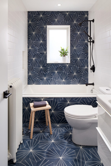
Special feature. “We used a patterned clay tile for a bold graphic accent on the floor, tub apron and shower wall, and kept the neighboring walls neutral,” Ashey says. “It was certainly fun to test the many ways the tile pattern could be laid out. It provided so many variables that it was hard to pick just one.”
Other special features. White tile side walls with white grout. Matte black shower fixtures.
Designer tip. “Keep things simple,” Ashey says. “Sometimes a fun and whimsical space doesn’t have to be overdesigned or have too many ideas. We love bold and graphic — it can go a long way.”
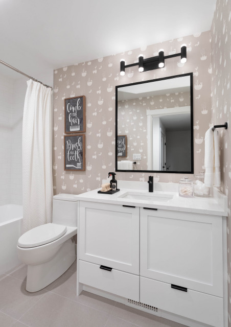
Designer: Lisa Hansen of Area3 Design Studio
Location: Surrey, British Columbia, Canada
Size: 45 square feet (4.2 square meters); 5 by 9 feet
Homeowners’ request. “This is a kids’ bathroom in a modern farmhouse,” designer Lisa Hansen says.
Special features. Playful wallpaper and art. “It provides that kid-friendly flavor,” Hansen says.
Other special features. White Shaker-style vanity. Black hardware, plumbing fixtures, mirror frame and light fixture. Large-format porcelain floor tile.




Designer: Helly Duncan of Design Matters Home
Location: Boulder, Colorado
Size: 45 square feet (4.2 square meters); 5 by 9 feet
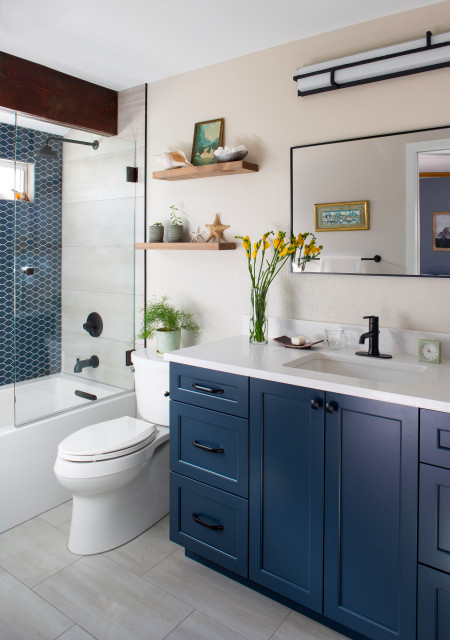
Homeowners’ request. “The homeowners wished to update their current full bath, which was only accessible from the kitchen, into a master bath,” designer Helly Duncan says. “We decided to expand the bathroom footprint by shrinking a hallway closet, closing off the existing door and incorporating a pocket door into the master bedroom for a fully redesigned master bath.”
Special feature. “This is their only tub, so we had to keep it,” Duncan says. “I wanted to create a feature wall since the space is so small, hence the beautiful teardrop matte glass tiles on one wall. This feature wall helps detract from the tub and keeps your eye focused on the accent when you come into the bathroom.”
Other special features. Navy blue vanity with quartz countertop. Matte black faucet, shower fixtures, mirror frame and light fixture. Wood structural beam above the shower. Large-format tiles cover the side walls in the shower (in a stacked pattern) and the floor (in a brickset pattern).
Designer tip. “Mixing scales is one key to making design cohesive, calming and interesting,” Duncan says. “We achieved this with the large-format linearly stacked tiles mixed with the smaller contrasting teardrop tile.”
Light fixture: Sirato by George Kovacs, Minka Aire; wall paint: Grecian Ivory, Sherwin-Williams