While classic palettes made a strong showing, new ideas for layouts caught Houzz users’ attention this year
 If you’re wondering what will be big in bathroom design in 2020, just take a look at what captivated Houzz users in 2019. Classic Shaker-style cabinets, black-and-white color schemes, marble surfaces, fresh mixes of white and wood, farmhouse-inspired style and brass and matte-black finishes all feature in the following countdown of the 10 most-saved bathroom photos of 2019. More likely than not, we’ll be seeing similar elements in the new year.
9. Classic Black and White
Many would have opted to tear down and rebuild this run-down house in Pittsburgh, but these homeowners turned to Katy Popple Design to help them renovate instead. She used classic elements like white subway tile, black hexagonal floor tile and quartzite slabs to suit the 100-year-old home. But details such as darker grout, elongated subway tile, clear glass divider and black fixtures update the look.
Tip: Popple says ledges in showers are simpler to plan and install than niches. This one is 4 to 5 inches deep and runs the entire length of the shower.
8. Refined Farmhouse
While this bathroom is almost entirely white, designer Marianne Simon used a range of textures to give it a refined layered look. The mix of herringbone pattern on the floor, shiplap walls, veined countertop and glints of warm metallics creates a farmhouse look that leans elegant rather than rustic.
Tip: Yes, you can use a chandelier in a bathroom, and to great effect. Just be sure you follow building codes for its placement.
7. Black and White and Shades of Gray
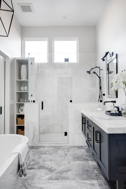
In this bathroom by Three Salt Design, the patterns in the floor tile, shower tile and countertop add movement and a range of gray hues to the color scheme.
Tip: Pocket doors are smart space savers for tight bathroom spaces because they eliminate the need to make room for a door’s swing.
6. Dramatic Expanses of Tile
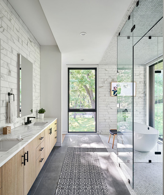
For this Kansas City, Missouri, bathroom, the design-build pros at Hufft continued the mosaic tile from the tub and shower floors onto the ceiling. This emphasizes the room while delineating different zones.
Tip: Add wood textures to a light and neutral color scheme to create warmth and interest.
5. Crisp Nautical Style
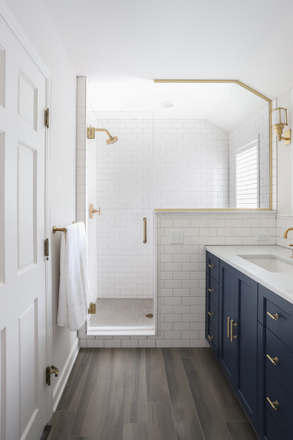
A palette of navy blue, white, gold and wood brings to mind a jaunty seafaring vessel or a classic naval uniform, which makes for a nice, clean look in a bathroom. Even the drawer pulls in here resemble dock cleats. The pros at TreHus Architects+Interior Designers+Builders warmed the space up with a porcelain floor tile that resembles wood.
Tip: Wood-look porcelain tile is a great low-maintenance option for a bathroom floor.
3. Farmhouse Drama
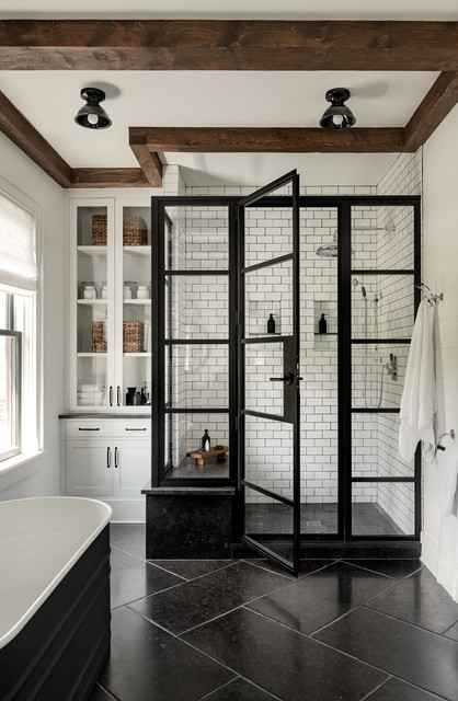
Designer Susana Simonpietri of Chango & Co. and James Crisp and Sandee Mahoney of Crisp Architects collaborated on this bathroom to give the homeowners a balance of traditional farmhouse and modern design styles. The large-format Belgian bluestone flooring, dark grout, ceiling lights and black steel shower surround infuse the room with an updated feel, while the Shaker-style cabinetry, ceiling beams, subway tile and vanity lend a sense of age. The contrast between dark and light and between wood and steel amps up the drama.
Tip: Smaller spaces don’t require small-scale items. The large-format floor tile seen here keeps a variety of scales at play and anchors the room beautifully.
2. Organic Minimalism
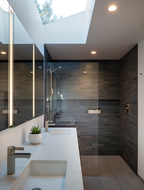
Sometimes people associate minimalism with starkness, but that’s simply not the case. In this bathroom by design-build firm building Lab, the lines are clean and simple and the material and color palette are limited. But the deep earthy tones in the tile, the texture in the countertop and the views of the sky and foliage from above give it a comforting organic feel.
Tip: A handmade look and feel, like that of the Heath Ceramics tile in the shower seen here, can make a room feel more personalized and compelling.
1. Calm With Brassy Bling
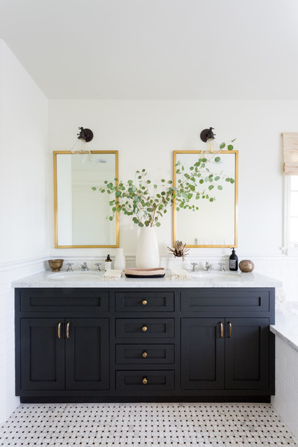
The popularity of brass finishes surged in 2019. Whether antiqued, aged, brushed or polished, the finish added warmth to all styles of bathrooms. In this transitional design by Mandy Cheng Design and LA Design Build, the metal adds some pizzazz to the ever-so-light lilac cabinets and white walls.
Tip: Wall-mounted faucets save space and promote an uncluttered countertop look.







10. Bold Tile in a Wet-Room Layout
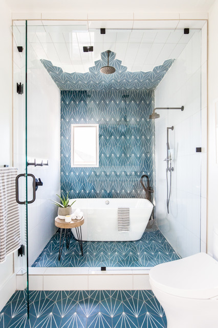
Interior designer Andrea West created enough space in this long and narrow bathroom for a roomy shower stall and a freestanding bathtub by combining them in a wet-room layout. An eye-catching geometric cement tile extends from the floor up the wall and onto the ceiling.
Tip: If you’ve got a window in your shower, consider using a clear glass shower surround to allow natural light into the entire room.